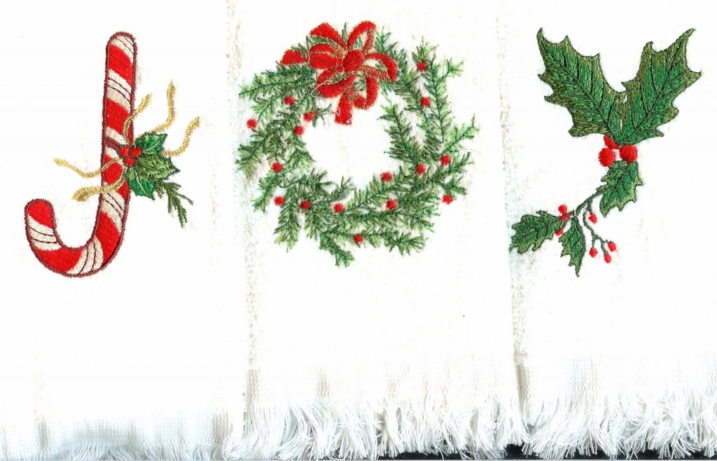
 Tick tock, tick tock……Christmas is coming. As I work to finish up some small gifts for extended family, including several in-laws of in-laws, I am so glad that I have an embroidery machine.
In my opinion, these fingertip towels and the other presents I am making are nice enough to show that some effort was extended on their behalf, yet small enough to prevent the recipients from feeling obliged. And if they don’t care for my gifts, they can still be used to dry hands or to dust.Actually,  they are all such nice people that I do hope they are pleased.
Hung over a towel rack, these little towels add holiday decoration to a room often left with its everyday, pre-holiday decor. Searching my design library, I came up with designs to spell out JOY. Some thought was given to using a hanging ornament for the O, which would have worked just as well, but I liked the look of this particular wreath.
Designs used were:
J–Anita Goodesign Jolly Holiday
O–Bernina Happy Holidays 782
Y–Amazing Designs Holly Leaves and Berries (design was edited considerably to make the Y)
I do have a few tips for creating some unity and cohesiveness when combining a set of unrelated designs.
1. It is best to choose designs of similar mood, be that elegant, country, whimsical, heirloom or whatever.
2. It helps if all the designs are of similar size and uniformly outlined or not.
3. It is beneficial to have a common component, such as the holly in each of these designs.Â
4. It works best to use the same colors, i.e. the same red, the same greens, etc.  throughout the design. This makes them appear to be related.
I was very annoyed when I finished this set and realized that I had not outlined the holly Y in metallic gold as I had intended.  It would have looked so much nicer. I hadn’t taken the time to change the color in the design thinking that I would just remember to do it. But the phone rang, one of the dogs was begging for a treat and as wonderful as my Brother Duetta is, it told me only the color in the actual design, not the color I had planned to use. I doubt even Brother has an upgrade that will read your mind. So the holly is outlined in green and is the only letter with no gold metallic.Â
Still, it’s unlikely that the in-laws of my in-laws will notice or be very concerned about this oversight. I just hope my gift will give them a little joy.


One response to “JOY”